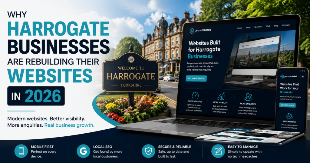

A responsive website is no longer optional. In 2026, your website needs to work properly on mobiles, tablets, laptops, desktops, and every screen size in between.
If your website is difficult to read, slow to load, or awkward to use on a phone, visitors will leave quickly. That can mean fewer enquiries, fewer sales, and weaker performance in search results.
What Does Responsive Website Design Mean?
Responsive website design means your website automatically adjusts to suit the screen it is being viewed on. Instead of forcing users to zoom, scroll sideways, or struggle with tiny buttons, the layout adapts to create a smoother browsing experience.
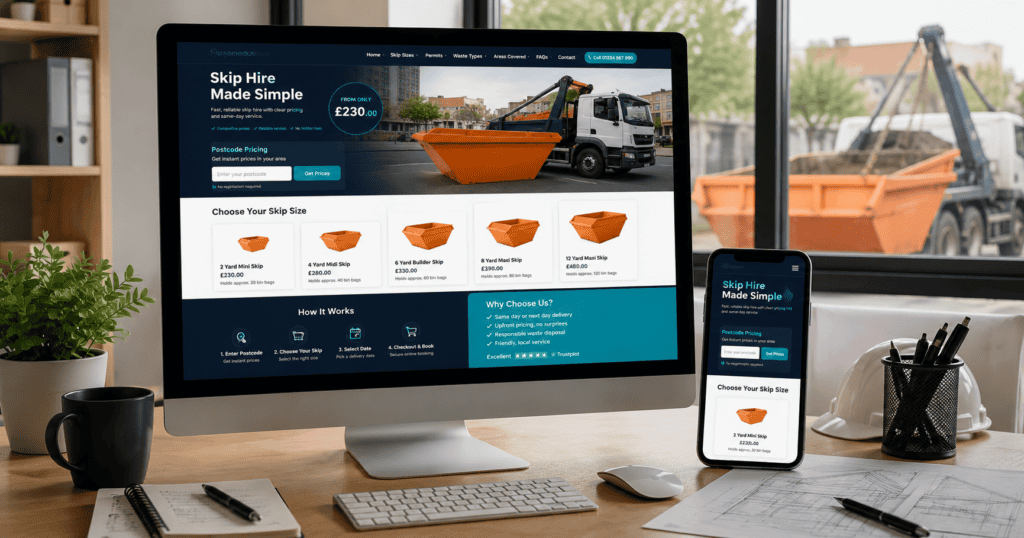
For example, a desktop version of a website may show multiple columns, large images, and wider navigation. On mobile, that same content should stack neatly, remain easy to read, and keep important buttons simple to tap.
Why Mobile-Friendly Websites Matter
Most customers now browse websites from mobile devices. Whether they are searching during a lunch break, comparing services at home, or checking your business while out and about, your website needs to work instantly.
A mobile-friendly website can help improve:
- User experience
- Website enquiries
- Online sales
- Search engine visibility
- Trust in your business
- Page speed and performance
Google Expects a Good Mobile Experience
Google wants to show users websites that are useful, fast, and easy to navigate. If your website performs poorly on mobile, it can affect how users interact with your site and how search engines understand its quality.
Responsive design helps keep your website easier to manage too. Instead of maintaining separate desktop and mobile versions, one properly built website can adapt across different devices.
Common Signs Your Website Is Not Responsive
If you are unsure whether your current website is working well on mobile, look out for these warning signs:
- Text is too small to read
- Buttons are difficult to tap
- Images break the layout
- Menus are hard to use
- Pages load slowly
- Users need to zoom in and out
- Forms are difficult to complete
Responsive Design Helps Conversions
A responsive website is not just about appearance. It can directly affect how many people contact your business, request a quote, book a service, or buy a product.
When your website is easy to use, visitors are more likely to stay, explore your services, and take action. When it feels clunky or outdated, they are more likely to leave and choose a competitor.
Final Thoughts
Your website should give every visitor a smooth experience, no matter what device they use. A responsive website helps protect your brand, improve usability, and support better long-term SEO performance.
If your website feels outdated or does not work properly on mobile, now is the time to improve it. A modern responsive website can make your business look more professional and help turn more visitors into customers.
If you need help building a modern, responsive website, visit our website design Harrogate page or contact Get Me Branded to discuss your project.